Blue has quietly dominated interior design for decades, but it’s never been more versatile than it is right now. From deep navy accent walls to soft powder blue cabinetry, this color works in virtually every room, with every style, and alongside nearly any material palette. Unlike trendy colors that peak and fade, blue adapts, it can anchor a room or disappear into the background, create energy or calm a chaotic space. For DIYers and homeowners looking to refresh a room without a full gut job, blue offers an approachable starting point. Whether rolling paint, choosing tile, or selecting upholstery, understanding how to use blue strategically turns a simple color choice into a design decision with staying power.
Key Takeaways
- Blue interior design offers unmatched versatility, spanning from deep navy to soft pastels and working across every room style and material palette without losing relevance.
- Dark blues like navy add sophistication and hide wear in high-traffic areas, while light blues open up smaller spaces and promote calm—choose your shade based on room size, lighting, and desired mood.
- Psychology backs blue’s popularity: studies show it lowers heart rate and promotes relaxation, making it ideal for bedrooms, bathrooms, and home offices where tranquility is a priority.
- Strategic pairings elevate blue interior design—pair navy with brass for vintage luxury, use white for classic cleanliness, or combine with wood tones and warm metallics for a balanced, sophisticated look.
- Unlike trendy neutrals that cycle seasonally, blue has remained a timeless anchor color across multiple design movements, ensuring your investment won’t feel dated in three years.
Why Blue Is the Ultimate Color for Interior Design
Blue works because it spans the entire spectrum from warm to cool, light to dark, and muted to saturated. That range makes it uniquely adaptable. A homeowner can paint a bedroom in soft gray-blue and achieve a minimalist Scandinavian look, or use cobalt tile in a backsplash for a Mediterranean vibe. The color doesn’t lock anyone into a single aesthetic.
From a practical standpoint, blue is forgiving. It hides minor imperfections better than stark white or pale beige, especially in high-traffic areas. Lighter blues reflect natural light without the sterile feel of cool grays, while darker blues add depth without making a room feel closed in, assuming ceiling height and lighting are adequate.
Blue also has psychological advantages. Studies consistently show it lowers heart rate and promotes calm, which is why it’s favored in bedrooms, bathrooms, and home offices. It’s one of the few colors that can feel both energizing (think bright cerulean) and restful (soft sky blue) depending on saturation and context.
Unlike trendy neutrals that cycle in and out every few years, blue has stayed relevant across multiple design movements. It pairs well with natural wood tones, works alongside both warm and cool metals, and doesn’t clash with most stone or tile. For anyone planning a renovation or refresh, that versatility means the color won’t feel dated in three years.
Popular Shades of Blue and Where to Use Them
Not all blues perform the same way in a space. Choosing the right shade depends on room size, natural light, and the mood someone wants to create. Here’s how the most common blue families perform in real-world applications.
Navy and Dark Blues for Drama and Sophistication
Navy, midnight blue, and deep indigo bring weight and richness to a room. These shades work best in spaces with strong natural light or good artificial lighting, recessed LEDs rated at 3000K to 4000K prevent the color from feeling cave-like.
Navy excels as an accent wall in dining rooms, libraries, or primary bedrooms. It pairs exceptionally well with brass or aged bronze hardware, white trim, and natural fiber rugs. In kitchens, navy cabinetry has become a go-to alternative to white or gray. It hides wear better than lighter finishes and grounds a space when paired with marble or quartzite countertops.
One caution: dark blue in a small, poorly lit room can shrink the space visually. If the room lacks windows or relies on a single overhead fixture, consider using it on a single accent wall or in built-in shelving rather than all four walls.
Finish matters with dark blues. Matte or eggshell finishes absorb light and feel sophisticated, but they show scuffs in high-contact areas like hallways. For trim, doors, or cabinetry, a satin or semi-gloss finish improves durability and makes cleaning easier.
Light Blues and Pastels for Calm and Airiness
Powder blue, sky blue, and soft aqua open up a room and enhance natural light. These shades work well in smaller spaces, bathrooms, nurseries, guest bedrooms, or anywhere a sense of calm is a priority.
Light blues pair naturally with white shiplap, beadboard, or subway tile. They also complement light wood tones like maple or white oak, which have become popular in flooring and cabinetry. In bathrooms, a soft blue on the walls with white or gray hexagonal floor tile creates a classic, spa-like feel without requiring high-end fixtures.
Pastels can feel washed out if the undertone isn’t right. Blues with a hint of gray (sometimes called “gray-blue” or “blue-gray”) tend to feel more modern and grounded than pure baby blue, which can skew too sweet or dated. Sampling paint on a large poster board and observing it in different light throughout the day helps avoid regret.
Ceiling paint is another opportunity. A very pale blue ceiling in a bedroom or sunroom mimics open sky and can make the room feel taller. Use a flat finish to minimize glare and imperfections in the drywall.
How to Incorporate Blue into Different Rooms
Blue’s versatility means it can show up in almost any room, but the application and intensity should shift depending on function.
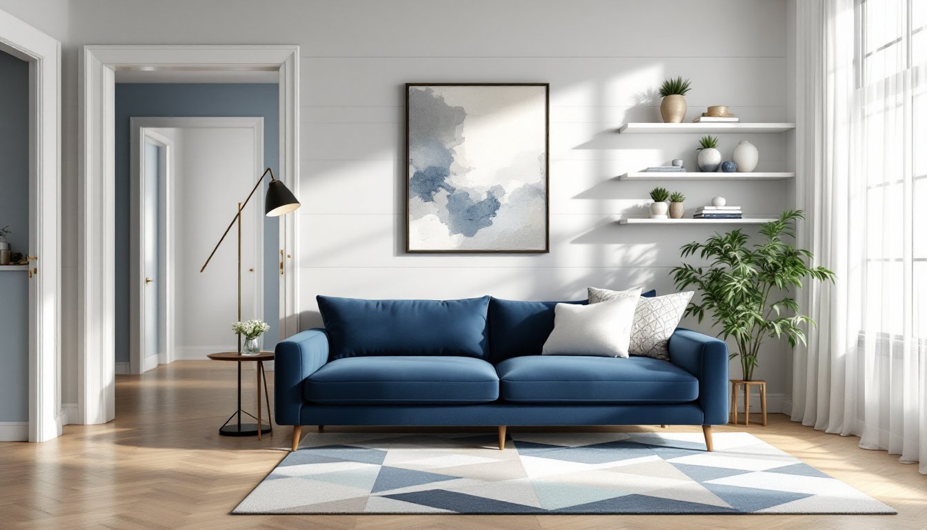
Living rooms benefit from blue as an anchor. A navy sofa or a large area rug in geometric blue and cream patterns grounds the space and lets other elements, artwork, throws, plants, rotate seasonally. If painting, consider a feature wall behind built-in shelving or a fireplace. It draws the eye without overwhelming.
Kitchens have embraced blue cabinetry, especially in two-tone layouts. Pairing navy or slate blue lower cabinets with white or light gray uppers creates contrast without the starkness of all-white kitchens. Blue works well with stainless steel appliances, white quartz countertops, and subway or zellige tile backsplashes. For a budget-friendly update, painting existing cabinets is feasible, just ensure proper prep with deglosser or TSP, a quality bonding primer, and a durable topcoat like urethane-fortified enamel.
Bathrooms are natural homes for blue. Coastal or spa aesthetics almost require it. Lighter blues on walls pair well with white or gray tile, chrome or brushed nickel fixtures, and natural textures like woven baskets or teak bath mats. For a bolder look, consider blue penny tile or large-format porcelain in deep teal on the shower surround. Grout color matters, bright white grout highlights the tile pattern, while gray grout blends and is more forgiving over time.
Bedrooms perform well with softer, cooler blues that promote rest. A muted blue-gray on all four walls with white or cream bedding and wood furniture creates a calm, hotel-like retreat. Avoid overly bright or saturated blues in sleep spaces, they can feel stimulating rather than restful.
Home offices can lean into deeper or more saturated blues to maintain focus and energy. A bold accent wall behind a desk, or blue built-in shelving, adds personality without distraction. Pair with warm wood desktops and task lighting to keep the room functional.
Pairing Blue with Other Colors and Materials
Blue is cooperative, but smart pairings elevate it from safe to striking.
White and blue is the classic pairing. It’s clean, nautical, and never feels wrong. Use white trim, ceilings, and baseboards to frame blue walls. In kitchens and bathrooms, white subway tile or shaker cabinetry balances blue without competing.
Blue and wood tones work across the spectrum. Lighter blues pair beautifully with white oak, maple, or birch, woods with minimal grain and warm undertones. Darker blues match well with walnut, cherry, or mahogany, which bring richness and contrast. Avoid pairing cool-toned blues with overly orange or red-toned woods unless there’s a neutralizing element like white or gray in between.
Blue and metallics is where personality shows. Brass and warm gold create a luxurious, slightly vintage feel, think navy walls with brass sconces or cabinet pulls. Brushed nickel and chrome feel more modern and crisp, especially with lighter blues. Matte black hardware has become a go-to for contemporary spaces and works with nearly any blue shade, adding contrast without heaviness.
Blue and neutral grays or beiges soften the color and prevent it from dominating. A soft blue-gray wall with warm beige upholstery and linen curtains feels layered and lived-in. This combination works well in living rooms and bedrooms where comfort is key.
Blue and green can be tricky but rewarding. Stick to analogous shades, teal with sage, navy with olive, sky blue with seafoam. Add natural textures like jute, rattan, or live plants to tie the palette together. Avoid overly saturated combinations unless going for a bold, eclectic look.
Contrasting colors like terracotta, rust, or burnt orange bring warmth and energy to blue spaces. These pairings work best as accents, throw pillows, artwork, or a single piece of furniture, rather than equal color distribution.
Conclusion
Blue’s staying power in interior design isn’t about trend, it’s about function and flexibility. It adapts to different styles, materials, and moods without requiring a complete redesign when tastes shift. Whether someone is painting a single accent wall, refinishing cabinetry, or selecting tile, blue offers a reliable foundation that works with both DIY budgets and long-term vision. The key is choosing the right shade for the space and pairing it thoughtfully with the materials already in play.