
Choosing a color palette for interior design isn’t about flipping through paint chips and hoping for the best. It’s a deliberate process that ties together every element in a room, from wall color to trim, furniture, textiles, and accessories. A well-planned palette creates visual flow, sets the mood, and makes spaces feel intentional rather than haphazard. Getting it right means understanding color relationships, proportions, and how light interacts with pigment throughout the day. This guide breaks down the principles, rules, and practical steps for building a cohesive color scheme that works in real homes, not just on mood boards.
Key Takeaways
- A color palette in interior design deliberately selects three to five hues across walls, furniture, and accessories to create visual harmony and cohesion throughout a space.
- The 60-30-10 rule balances color distribution by using 60% dominant color, 30% secondary color, and 10% accent color to prevent any single hue from overwhelming the room.
- Light Reflectance Value (LRV) matters significantly—colors above LRV 50 brighten rooms and increase perceived size, while colors below LRV 30 create coziness and may make spaces feel smaller.
- Always test paint samples on multiple walls at different times of day before committing, as natural light, ceiling height, and adjacent colors dramatically shift how colors read in your actual room.
- Avoid common mistakes like ignoring undertones, using too many colors, and skipping ceiling and trim, all of which disrupt the cohesion of your interior design color palette.
- Room function should guide your palette choice—bedrooms benefit from calm blues and greens, while kitchens and dining areas can handle energizing reds, oranges, and bold accent walls.
What Is a Color Palette in Interior Design?
A color palette in interior design is the intentional selection of colors used throughout a space to create cohesion and visual harmony. It typically includes three to five hues applied in varying proportions across walls, ceilings, trim, flooring, furniture, and accessories.
Unlike picking a single paint color, a palette accounts for how multiple colors interact. It includes:
- Dominant color: The main hue that covers the largest surface area (usually walls or large furniture pieces)
- Secondary color: A supporting hue that complements or contrasts with the dominant color
- Accent colors: Pops of color used sparingly in pillows, art, hardware, or small decor items
Palettes can be monochromatic (variations of one color), analogous (colors next to each other on the color wheel), complementary (opposite colors that create contrast), or triadic (three evenly spaced colors). Each approach delivers a different visual effect and level of contrast.
Why Your Color Palette Matters More Than You Think
Color affects perceived room size, natural light reflection, and even resale value. A poorly chosen palette makes spaces feel disconnected or chaotic, while a thoughtful one creates flow between rooms and enhances architectural features.
Light reflection is critical. Paint with a Light Reflectance Value (LRV) above 50 brightens rooms and makes them feel larger, while low LRV colors (below 30) absorb light and can make spaces feel smaller or cozier. North-facing rooms with cooler natural light benefit from warm hues (yellows, terracottas), while south-facing spaces can handle cooler tones without feeling sterile.
Color also impacts resale appeal. Neutral palettes, grays, beiges, soft whites, typically appeal to broader audiences, but strategic accent walls or bold trim in high-end finishes can differentiate a property. Overly trendy or personalized schemes may require repainting before listing.
Finally, color sets emotional tone. Blues and greens lower perceived room temperature and promote calm (ideal for bedrooms), while reds and oranges energize spaces like dining rooms or home gyms. Understanding these effects helps homeowners design with purpose rather than impulse.
The 60-30-10 Rule: The Foundation of Every Great Color Scheme
The 60-30-10 rule is a proportion guideline used by designers to balance color distribution in a room. It breaks down as:
- 60% dominant color: Walls, large furniture, or flooring
- 30% secondary color: Upholstery, curtains, rugs, or cabinetry
- 10% accent color: Throw pillows, artwork, hardware, or small decor
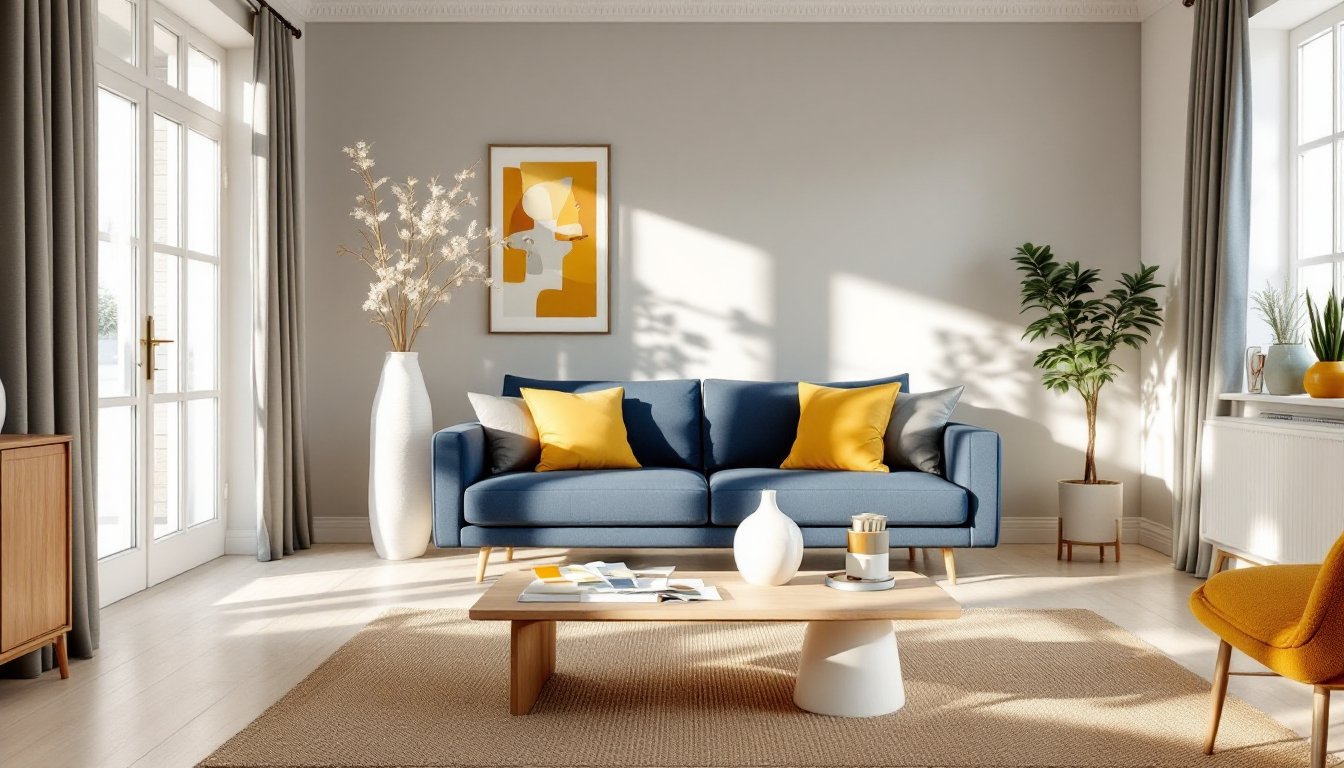
This ratio prevents any single color from overwhelming the space while maintaining visual interest. For example, in a living room, the dominant color might be a warm gray on the walls (60%), the secondary a navy blue sofa and curtains (30%), and the accent a mustard yellow in pillows and a ceramic vase (10%).
The rule is flexible. In kitchens with extensive cabinetry, the cabinets may serve as the dominant color, with walls and backsplash as secondary, and hardware or bar stools as accents. In open floor plans, the 60-30-10 ratio should flow across connected spaces to maintain cohesion, shift the proportions slightly room to room, but keep the core palette consistent.
It’s not a hard law. Some designers push 70-20-10 or layer in a fourth neutral. But the framework prevents the common mistake of splitting colors evenly, which often reads as indecisive rather than balanced.
How to Choose the Perfect Color Palette for Your Space
Start by assessing existing fixed elements that won’t change: flooring, countertops, tile, or brick. These anchor the palette. If there’s honey oak flooring, warm neutrals and earth tones will harmonize better than cool grays. Existing granite or tile with flecks of color can guide accent choices.
Next, consider natural light. Paint large samples (at least 2’×2′) on multiple walls and observe them at different times of day. Morning light skews cooler, afternoon light warmer. LED bulbs (measured in Kelvin) also shift color perception, 3000K gives a warm white, while 5000K reads as daylight and can make warm paint look dingy.
Room function dictates mood. Bedrooms benefit from low-stimulation hues (soft blues, greens, taupes). Kitchens and dining areas can handle bolder, appetite-stimulating colors (reds, oranges, deep greens). Home offices need focus-friendly tones, navy, charcoal, or muted greens work well.
Use the color wheel to build relationships:
- Analogous schemes (e.g., blue, blue-green, green) feel cohesive and calm
- Complementary schemes (e.g., blue and orange) create energy and contrast
- Monochromatic schemes layer tints, tones, and shades of one hue for subtle sophistication
Test paint in the actual room. Lighting, ceiling height, and adjacent colors all shift how a hue reads. A “perfect greige” in the store may go purple in a north-facing room or yellow next to warm wood trim. Always sample before committing to five gallons.
Popular Interior Design Color Palette Styles to Explore
Modern Farmhouse: Warm whites (LRV 75–85), soft grays, black accents, and natural wood tones. Think shiplap painted in Alabaster or Swiss Coffee, matte black hardware, and reclaimed wood shelving. This palette pairs well with brushed nickel or oil-rubbed bronze fixtures.
Coastal: Soft blues, sandy beiges, crisp whites, and seafoam greens. Use high-LRV whites on trim and ceilings to maximize light reflection. Natural fiber rugs, linen textiles, and driftwood accents reinforce the palette. Avoid overly bright turquoise unless going full nautical.
Mid-Century Modern: Warm wood tones (walnut, teak), mustard yellow, burnt orange, olive green, and charcoal. Pair with white or cream walls to let furniture and textiles pop. Brass or aged brass hardware complements the warm palette.
Industrial: Exposed brick, concrete gray, matte black, and warm metallics (copper, aged steel). Use darker accent walls sparingly, they can make rooms feel smaller unless ceilings are 9+ feet. Pair with Edison bulbs and metal fixtures in black or gunmetal.
Scandinavian: Soft whites, light grays, pale blush, and black accents. Emphasizes natural light and minimalism. Use texture (linen, wool, light wood) to add warmth without color saturation. Keep walls and large surfaces neutral: bring in muted pastels through textiles.
Maximalist/Eclectic: Jewel tones (emerald, sapphire, ruby), rich neutrals (charcoal, chocolate), and metallic accents (gold, brass). Requires confidence and careful layering, use the 60-30-10 rule to avoid visual chaos. Deep accent walls work well in dining rooms or powder rooms.
Common Color Palette Mistakes and How to Avoid Them
Ignoring undertones: Every neutral has an undertone, pink, yellow, green, or blue. A beige with pink undertones will clash with cool gray furniture. Compare paint samples against existing elements (flooring, countertops) in natural light to spot undertone mismatches.
Using too many colors: More than four or five colors in a single room creates visual noise. Stick to a core palette and vary saturation or tone instead of introducing new hues. If a room feels flat, adjust texture or finish (matte vs. satin) rather than adding another color.
Skipping the ceiling and trim: White ceilings and trim are safe, but painting them in palette colors creates cohesion. Ceilings in a slightly lighter tint of the wall color make rooms feel taller. Trim in a contrasting hue (like black trim with white walls) adds modern edge but requires precision cutting-in and multiple coats.
Matching too perfectly: Overly coordinated spaces, where pillows exactly match walls, feel staged and sterile. Vary shades slightly. If walls are a soft sage, use pillows in a deeper moss or a complementary rust.
Forgetting finish sheen: Flat and matte paints hide imperfections but don’t clean well (avoid in kitchens, baths, and high-traffic areas). Eggshell and satin are durable and washable. Semi-gloss works for trim and doors but highlights wall flaws. The same color in different sheens will read as different tones.
Not accounting for open floor plans: Colors shift when viewed from adjacent rooms. In open layouts, carry the palette through, use the dominant color in one room as an accent in the next to create visual flow. Abrupt color changes between connected spaces feel jarring.
Conclusion
A well-executed color palette isn’t about following trends, it’s about understanding proportion, light, and how hues interact in real spaces. The 60-30-10 rule provides a framework, but successful schemes also account for undertones, finishes, and fixed elements like flooring and trim. Test samples in the actual room, at different times of day, before committing. And remember: cohesion beats perfection. A thoughtful palette creates flow and makes a home feel intentional, even if every shade isn’t Instagram-ready.