
Opposition interior design has become one of the most powerful approaches for creating visual impact in residential spaces. Rather than relying on monochromatic palettes or matchy-matchy furniture sets, this design strategy deliberately pairs contrasting elements, light against dark, rough against smooth, modern against vintage, to generate depth, interest, and personality. The technique isn’t new, but it’s gained traction as homeowners move away from safe, catalog-styled rooms toward spaces that feel intentionally curated. When executed correctly, opposition design transforms flat, forgettable interiors into dynamic environments that hold attention without overwhelming the senses.
Key Takeaways
- Opposition interior design pairs contrasting elements like light against dark and rough against smooth to create visual depth and personality without overwhelming the senses.
- High-contrast spaces feel more energizing and improve task performance, while low-contrast opposition creates sophisticated, subtly layered environments better suited for relaxation.
- Start with fixed architectural elements and choose one primary type of opposition per room, using the rule of three to repeat contrasting accents intentionally throughout the space.
- Test opposition design choices before permanent installation by using paint samples and material swatches in natural lighting, as light shifts dramatically throughout the day.
- Avoid common mistakes like ignoring undertones, mismatching scale, and neglecting adequate lighting, which all undermine the effectiveness of contrasting design elements.
- Opposition interior design creates dialogue between contrasting materials, textures, and colors, requiring shared scale or spatial relationship to coexist gracefully without competing.
What Is Opposition in Interior Design?
Opposition in interior design refers to the intentional pairing of contrasting elements within a single space to create visual tension and balance. It’s a design principle rooted in the idea that differences, when thoughtfully arranged, enhance one another rather than clash.
The concept draws from basic color theory and compositional balance used in fine art and architecture. Think of it as the visual equivalent of counterpoint in music, two distinct lines working together to create harmony. In practical terms, this might mean placing a sleek, lacquered black console table against a whitewashed shiplap wall, or layering a nubby wool throw over a smooth leather sofa.
Opposition differs from mere variety. Random assortment creates chaos: opposition creates dialogue. The key is that contrasting elements must share some common thread, scale, shape, or spatial relationship, that allows them to coexist without competing. A mid-century modern chair can sit comfortably next to an industrial steel side table if both share similar proportions and the color palette ties them together.
This approach gives designers and DIYers a framework for breaking rules without creating visual disasters. It’s particularly useful when working with existing architectural features that can’t be changed, like dark wood trim in an older home or exposed brick that dictates a certain aesthetic direction.
The Psychology Behind Contrasting Design Elements
Human perception is wired to notice differences. The eye is drawn to contrast because it signals important information, edges, boundaries, changes in environment. Interior designers leverage this neurological response to guide attention and create focal points within a room.
High-contrast spaces tend to feel more energizing and formal. A room with stark black window frames against white walls reads as crisp and decisive, which is why this combination shows up frequently in contemporary home offices and kitchens where focus and clarity matter. Research in environmental psychology suggests that high-contrast environments can increase alertness and improve task performance in short bursts, though they may feel overstimulating for spaces intended for relaxation.
Conversely, low-contrast opposition, such as pairing warm oak with cooler walnut, or matte charcoal with glossy slate, creates subtlety. These spaces feel sophisticated and require closer observation to appreciate the layering. They’re better suited for bedrooms, reading nooks, and living areas where extended comfort is the priority.
Balance is critical. Too much contrast in too many directions creates what designers call “visual noise”, the room demands so much attention that it becomes exhausting. The sweet spot typically involves one or two primary areas of opposition (such as color and texture) while keeping other elements relatively harmonious. This allows the eye to rest between moments of visual interest, much like white space functions in graphic design.
Key Types of Opposition in Interior Design
Light vs. Dark: Creating Drama Through Contrast
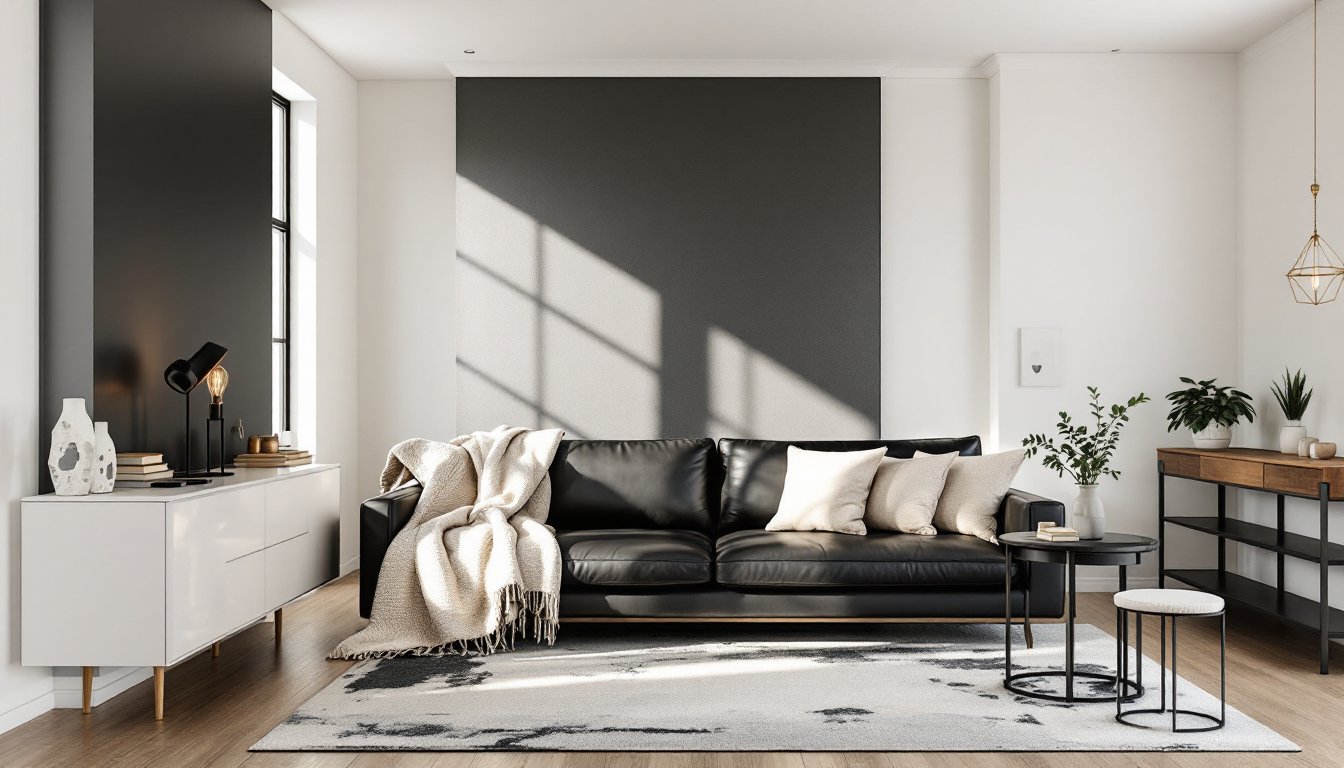
Color value contrast remains the most accessible and impactful form of opposition. The classic pairing of light walls with dark floors establishes an immediate sense of grounding, the room feels anchored rather than floating. Flipping this relationship (dark walls, light floors) creates drama and intimacy, though it requires adequate natural or artificial lighting to prevent the space from feeling cave-like.
Paint sheen also plays a role here. A flat black ceiling paired with semi-gloss white trim creates sharper contrast than similar colors in uniform sheens. This matters in rooms with architectural details worth highlighting, crown molding, wainscoting, or coffered ceilings benefit from sheen differentiation.
When working with color contrast, the 60-30-10 rule provides a practical framework: 60% dominant color, 30% secondary, 10% accent. In opposition design, the 10% accent is often where the strongest contrast lives, a jet-black range hood in an all-white kitchen, or a gallery wall of black-framed art against pale plaster.
One technical consideration: high color contrast can affect perceived room temperature. Dark, warm tones (deep browns, charcoals with red undertones) make spaces feel cozier but smaller. Light, cool tones (soft grays, pale blues) expand visual space but can read as sterile without textural warmth.
Texture and Material Opposites
Texture opposition might be less obvious than color contrast, but it’s equally powerful, and often more forgiving for DIYers nervous about bold color choices. Pairing materials with different tactile qualities adds dimension without requiring dramatic hue shifts.
Common effective pairings include:
- Rough-hewn wood beams against smooth drywall or plaster
- Polished marble or quartz countertops with matte-finish cabinetry
- Brushed metal hardware on glossy lacquered furniture
- Linen or cotton upholstery paired with leather accents
- Woven jute or sisal rugs layered under sleek glass coffee tables
The practical advantage of texture opposition is that it photographs poorly but lives beautifully. A room that looks flat in listing photos often reveals unexpected depth in person when light plays across varied surfaces throughout the day.
For DIY installations, mixing textures often requires less precision than color matching. A homeowner can install rough-sawn pine shiplap (actual dimensions typically ⅝” × 5½” after milling) without worrying that the stain perfectly matches existing trim, because the textural difference itself justifies the variation.
One caveat: textured surfaces collect dust and require more maintenance. Heavily textured stone, deep wood grain, or fabric wall treatments need regular attention. Gloss and semi-gloss finishes wipe clean easily, making them practical opposites to matte or textured elements in high-traffic areas.
How to Successfully Implement Opposition Design Principles
Start with existing fixed elements, flooring, tile, built-ins, or architectural details that aren’t changing. These establish one side of the opposition equation. If the room has medium-toned oak floors, for instance, contrast opportunities exist above: lighter walls and ceiling, or darker furniture and window treatments.
Choose one primary type of opposition per room. Trying to maximize color contrast, texture contrast, and style contrast simultaneously usually results in visual chaos. A room might feature strong light/dark opposition with moderate texture variation and minimal style mixing, or vice versa.
Use the rule of three for repeating contrasting elements. If dark accents appear in only one spot, they look like mistakes. Repeat the contrast in at least three places, perhaps black window frames, a black light fixture, and black cabinet hardware. This creates intentional rhythm.
Test before committing to permanent installations. Paint large poster boards or foam core sheets (available in 20″ × 30″ or larger at craft stores) with sample colors and prop them against walls at different times of day. Natural light shifts dramatically between morning and late afternoon, and opposition that works beautifully in north light might feel harsh in direct western sun.
For texture opposition, collect physical samples rather than relying on online images. A 2″ × 2″ stone sample or fabric swatch reveals how light interacts with the surface in ways that photos can’t capture. Most tile suppliers, lumber yards, and flooring stores provide samples for a small fee or deposit.
Consider the room’s function and duration of use. High-contrast, energizing opposition works well in spaces used for short bursts, entryways, powder rooms, home offices. Lower-contrast, subtle opposition suits spaces for extended relaxation, bedrooms, reading areas, meditation spaces.
When working with small spaces (under 120 square feet), limit strong opposition to accents rather than large surfaces. A small bathroom can handle a black vanity against white subway tile, but painting all walls dark would overwhelm the space. Use the smaller element as the contrasting anchor.
Common Mistakes to Avoid When Using Contrasting Elements
Ignoring undertones is the most frequent error. A “white” wall might have pink, blue, or yellow undertones that clash with the undertones in contrasting elements. Before committing to paint, compare samples against existing fixed materials in natural light. A cool gray floor will fight warm beige walls no matter how much contrast exists in value.
Mismatched scale kills opposition design. A delicate 18-gauge steel hairpin leg on a coffee table won’t effectively contrast with a massive reclaimed 6″ × 6″ timber mantel, it’ll just look out of place. Contrasting elements need similar visual weight to create balance.
Neglecting transition zones between contrasting areas creates jarring jumps. If dark flooring meets light walls, the baseboard and trim act as mediators. Choosing trim that’s too close to either extreme (stark white or dark stain) can make the transition feel abrupt. A mid-tone or material change (like natural wood trim) often bridges the gap more gracefully.
Over-relying on trends without considering longevity leads to expensive regrets. Black fixtures and matte black hardware have dominated opposition design since 2022, but they show water spots, fingerprints, and wear more visibly than brushed nickel or oil-rubbed bronze. If the homeowner isn’t committed to frequent cleaning, high-contrast finishes create maintenance headaches.
Forgetting lighting undermines the entire strategy. Opposition design depends on the eye perceiving differences, which requires adequate illumination. A room with beautiful textural contrast but insufficient lighting reads as flat and murky. Plan for layered lighting, ambient, task, and accent, with dimming capability to adjust contrast levels throughout the day.
Skipping the mock-up stage is tempting but risky. Professional designers create sample boards or digital renderings because opposition that works in theory sometimes fails in practice. At minimum, live with large paint samples and material samples in the actual room for several days before making irreversible decisions about permanent installations like tile, built-ins, or hardwood staining.
Opposition interior design isn’t about rules, it’s about relationships. When contrasting elements share a common language of scale, purpose, or spatial rhythm, they elevate each other. The result is a space that feels collected, intentional, and infinitely more interesting than matchy-matchy safe choices.