
Interior design isn’t just about making rooms look pretty, it’s about creating spaces that work. A well-designed home balances aesthetics with function, supports daily routines, and reflects the people living there. But where does someone start when facing a blank room or a dated layout? This handbook breaks down the core principles, room-specific strategies, and material selection tactics that turn generic spaces into thoughtfully designed homes. Whether tackling a single room refresh or planning a whole-house overhaul, understanding these fundamentals helps homeowners make confident decisions that last.
Key Takeaways
- Interior design fundamentals balance aesthetics with function by prioritizing traffic flow, measuring clearances (36 inches minimum for walkways), and designing spaces that support daily routines.
- Apply the 60-30-10 color rule—60% dominant color, 30% secondary color, and 10% accent color—to create harmonious palettes while considering Light Reflectance Value (LRV) for room brightness and natural light.
- Interior design mistakes like pushing furniture against walls, ignoring room function, and inadequate layered lighting (ambient, task, and accent) on separate switches destroy both usability and ambiance.
- Scale and context matter more than trends; choose timeless materials and finishes for permanent fixtures while reserving bold colors and patterns for reversible elements like paint and wallpaper.
- Select upholstery fabrics and materials based on use intensity: performance fabrics suit households with kids and pets, while natural fibers work best in low-traffic spaces.
- Test paint samples on multiple walls at different times of day and under various lighting conditions, as undertones shift significantly between incandescent bulbs and LEDs.
Understanding the Fundamentals of Interior Design
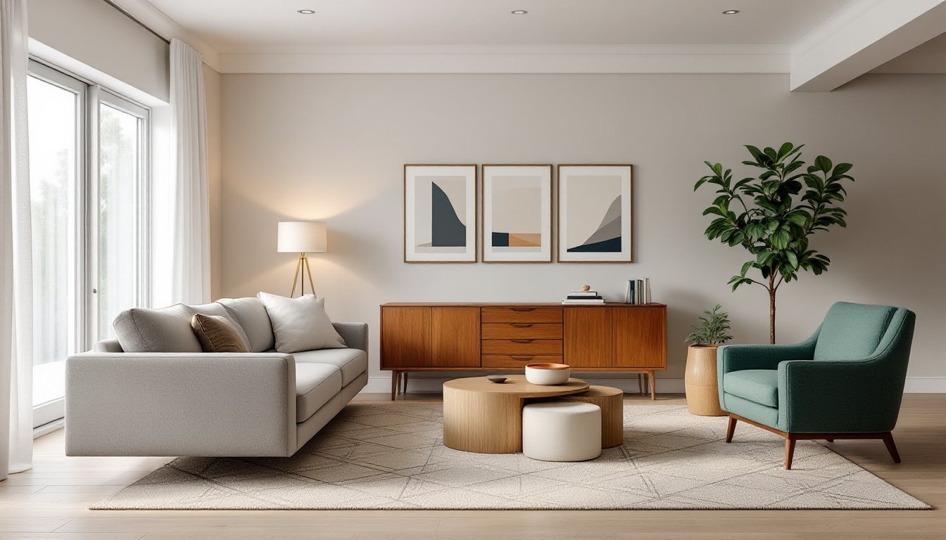
Good interior design rests on a few core concepts that apply to every room, regardless of style preference. Function comes first, a beautiful sofa that blocks a doorway or a dining table too large for its room creates daily frustration. Homeowners should map out traffic patterns, measure clearances (aim for 36 inches minimum for walkways), and identify how each space will actually be used before selecting a single paint chip.
Light, both natural and artificial, shapes how colors, textures, and proportions read. North-facing rooms tend toward cooler, softer light: south-facing spaces get warm, direct sun. This affects everything from paint sheen to fabric fade resistance. Layered lighting (ambient, task, and accent) gives flexibility and prevents the flat, single-source glare that kills depth.
Scale and context matter more than trends. A mid-century credenza might work beautifully in a 1960s ranch but feel out of place in a Colonial with eight-foot ceilings and traditional trim. Successful design respects the architecture it inhabits while introducing personal style through furniture, color, and accessories. It’s not about erasing a home’s character, it’s about working with it.
Essential Design Principles Every Homeowner Should Know
Several time-tested principles guide design decisions across styles and eras. Mastering these basics gives homeowners a framework for evaluating choices, whether shopping for a rug or planning a renovation.
Balance, Proportion, and Scale
Balance refers to visual weight distribution. Symmetrical balance (matching nightstands, centered artwork) feels formal and restful. Asymmetrical balance (a large sofa on one side, two chairs and a floor lamp on the other) creates energy and requires a careful eye. Radial balance, less common in residential spaces, arranges elements around a central focal point, think a round dining table with chairs or a circular staircase.
Proportion deals with how parts relate to the whole. The golden ratio (approximately 1:1.6) shows up in pleasing rectangles, from area rugs to wall art groupings. A common proportion error: hanging artwork too high. The center of a piece should sit at 57–60 inches from the floor (gallery standard), not near the ceiling.
Scale is about size relationships. Oversized furniture can anchor a large room but overwhelm a small one. A 92-inch sofa might suit a 20-foot living room but swallow a 12-foot den. Varying heights, tall bookcases, low-slung chairs, mid-height tables, keeps the eye moving and prevents monotony.
Color Theory and Palette Selection
Color sets mood and impacts perceived room size. The 60-30-10 rule offers a foolproof palette structure: 60% dominant color (walls, large furniture), 30% secondary color (upholstery, rugs, curtains), and 10% accent color (pillows, art, accessories).
Cool colors (blues, greens, grays) recede visually, making small rooms feel larger and bright spaces calmer. Warm colors (reds, oranges, yellows) advance, adding coziness but shrinking perceived space. Neutral backbones, whites, grays, taupes, provide flexibility as tastes evolve.
LRV (Light Reflectance Value), printed on most paint chips, measures how much light a color reflects on a 0–100 scale. Whites sit above 80: deep navies below 10. Rooms with low natural light benefit from higher LRV paints to maximize brightness. Adjacent rooms should stay within 10–15 LRV points of each other to avoid jarring transitions.
Test paint samples on multiple walls and observe them morning, noon, and evening, artificial light shifts undertones significantly. A “greige” might read warm beige under incandescent bulbs and cool gray under LEDs.
Room-by-Room Design Strategies
Each room type demands specific functional considerations that inform design decisions.
Living rooms need flexible seating arrangements that help conversation without blocking views or traffic. Arrange seating no more than 8–10 feet apart for comfortable dialogue. Anchor the space with an area rug large enough that front furniture legs rest on it, this visually groups the seating and defines the zone.
Kitchens follow the work triangle principle: sink, stove, and refrigerator should form a triangle with sides totaling 13–26 feet. Counter height is typically 36 inches: island seating requires 42–48 inches of clearance behind stools. Adequate task lighting under cabinets prevents shadows on work surfaces, LED strip lights work well and run cool.
Bedrooms prioritize restful atmospheres. Position the bed as the focal point, ideally on the wall opposite the door with nightstands on both sides (24–30 inches wide minimum for a lamp and phone). Window treatments should provide blackout capability if light sleepers occupy the room. Avoid placing beds under windows in cold climates, heat loss and drafts disrupt sleep.
Bathrooms require moisture-resistant materials and ventilation. Exhaust fans should provide 1 CFM per square foot minimum (check local codes). Vanity lighting belongs on either side of mirrors, not above, to eliminate shadows on faces. Slip-resistant flooring (textured porcelain or natural stone with a honed finish) beats glossy tile for safety.
Home offices need ergonomic desk height (28–30 inches), task lighting positioned to avoid screen glare, and acoustic control if video calls are common. Add a sound-absorbing rug and fabric window treatments to reduce echo in hard-surfaced rooms.
Selecting Furniture, Materials, and Finishes
Material choices determine durability, maintenance, and long-term satisfaction. Shortcuts here usually backfire.
Upholstery fabric should match use intensity. Performance fabrics (often polyester or acrylic blends treated for stain resistance) handle kids, pets, and spills. Natural fibers like linen and cotton breathe well but stain more easily. Check double rub counts (Wyzenbeek test), anything above 15,000 suits moderate residential use: 30,000+ handles heavy traffic.
Wood furniture quality shows in joinery. Dovetail joints (interlocking finger-like cuts) on drawers signal solid construction: stapled joints fail quickly. Solid wood beats veneer for longevity, but quality veneer over plywood can resist warping better than solid wood in humid climates.
Flooring varies wildly by room. Engineered hardwood (thin hardwood layer over plywood core) handles moisture fluctuation better than solid hardwood and works over concrete slabs. Luxury vinyl plank (LVP) offers water resistance and budget-friendly installation, though it won’t add resale value like real wood. Tile requires professional installation for durability, lippage (uneven tile edges) and hollow spots indicate poor workmanship.
Countertops balance aesthetics and practicality. Quartz (engineered stone) resists stains and never needs sealing: granite requires annual sealing but offers unique patterns. Butcher block adds warmth but demands regular oiling and shows wear. Laminate technology has improved dramatically, high-pressure laminates now mimic stone convincingly at a fraction of the cost.
Paint finish affects durability and cleanability. Flat/matte hides imperfections but doesn’t scrub well, reserve it for ceilings and low-traffic adult spaces. Eggshell or satin works for most walls, offering some washability. Semi-gloss suits trim, doors, and moisture-prone areas (bathrooms, kitchens) because it repels water and wipes clean easily.
Common Interior Design Mistakes to Avoid
Even experienced DIYers stumble on predictable pitfalls. Recognizing these early saves time and money.
Pushing all furniture against walls creates a bowling alley effect and wastes space. Floating furniture away from walls (even 12–18 inches) establishes intimacy and improves flow. Use area rugs to anchor groupings.
Ignoring room function leads to beautiful but unusable spaces. A dining table that seats eight sounds impressive until realizing the household entertains twice a year, a smaller table with leaves offers flexibility without daily crowding.
Inadequate lighting kills ambiance. One overhead fixture rarely suffices. Layer ambient (recessed or flush-mount ceiling), task (pendant over island, reading lamp), and accent (picture lights, LED strips) sources on separate switches or dimmers. Aim for 50–75 lumens per square foot in living areas, 70–80 in kitchens.
Hanging curtains too low or too narrow. Mount rods 4–6 inches above the window frame or at ceiling height to elongate walls. Panels should extend 3–6 inches beyond each side of the window when open, allowing full light exposure.
Choosing trendy over timeless for permanent fixtures. Bold wallpaper or paint colors work beautifully, they’re reversible. Installing a bright pink tile backsplash or lime green countertops creates expensive regret when tastes shift.
Skipping samples and mockups. Paint, fabric, and flooring all look different in-home versus in-store. Bring samples home, live with them for a few days, and view them in the space’s actual lighting before committing.
Interior design eventually serves the people inhabiting the space. Master these fundamentals, make deliberate choices aligned with function and lifestyle, and the result will be rooms that work as well as they look, no design degree required.